SUMMONERS WAR
Figure 5.6 Summoners War: splash screen (Com2uS 2018).
Adapting Game IP into Linear Content for a Global Audience
By Wilson J. Tang
Franchise Art Director, Summoners War; Co-Founder/Creative Director Kabam (mobile games); Visual Effects, Art Director Need for Speed, Electronic Arts; Art Director ILM StarWars: Episode 2 and Ang Lee’s Hulk; among other past roles
Introduction
Adapting intellectual property (IP) from one medium to another typically has two main goals. The first is to continue to delight and engage the original fans. The other is to find a way to expand a property’s reach and extend its lifetime by adding in new fans and audience members. The challenge is to strike the right balance between keeping the original fans happy while ensuring that the property speaks to a wider audience in a universal way. To do this effectively, it takes a concerted effort to make sure that all stakeholders are aligned around key canon-affecting decisions, no matter how big or small. Despite the proliferation of new platforms and devices, there is no better way to capture an audience’s eyes, hearts, and minds than by crafting beautiful, memorable, and most importantly timeless characters and worlds that can evolve into all forms of content.
Summoners War is a mobile game created and owned by Com2uS (C2), a Korean game company. It is a mobile turn-based strategy loved by hundreds of millions of fans all over the world that is set in a sprawling world full of unique characters, magic, and monsters.
When I first saw Summoners War, I was thrilled at the opportunity to help shape the evolution of this beloved global property given the rich and varied world it provided, and the many interesting characters it inhabited. C2 reached out to Skybound Entertainment (SB), a multi-platform media company originally founded on the success of The Walking Dead, to partner on creating a timeless multi-platform franchise strategy for their property.
When we started the project, Summoners War was played around the world with its core audience in Asia. At this time it had just over 75 million users. C2’s decision to adapt this property beyond the game started by targeting the North American audience. Their goal was to tell stories in various formats to illustrate the narrative possibilities of this universe in comics, books, television, and beyond. The expanded content was being developed to reach new audiences and fans as a way to help ensure the property’s longevity beyond the game.
Determining what key elements and traits should be kept and highlighted versus those that should be de-emphasized was our starting place, from which we developed a franchise look and style for all mediums. Our approach to this process was to do this in collaboration with C2, working with them as real partners throughout the process as opposed to working on our own. The reason for this collaboration is that as key decisions are made, the creators of the game know their fans and core canon better than anyone. Rather than going in a direction that could isolate the fans, we leveraged their knowledge to ensure that we would keep their fans happy and engaged for the future, while expanding the brand for new audience members in formats we had the expertise in.
We started the adaptation process by creating a universe bible that outlined key timelines, rules of the universe, core characters, their backgrounds, and their interconnected stories. As we developed stories for the franchise, we also worked with C2 to create a cohesive visual style of the main characters around which the universe bible was being written. This style was solidified in our first narrative extension to be launched to the public, an animated short film entitled “Friends and Rivals.” This case study will take you through the creative process and journey to bring the look and style of the evolved franchise, beyond the game, to life.
Storyline: Friends and Rivals
Here is a summary of the storyline that was agreed to for our short film. This concept was used to create our storyboard, animatic and voice track, all of which helped in forming the
visual style of the short:
Sent by the Council to retrieve a powerful, magical gemstone artifact, before the sky island where it is located collapses, Summoners Durand and Morgana, along with their technical support the Banian, arrive to find that the location is already unstable. After battling Golem protectors of the gemstone with their monsters, the Summoners’ sense of competition gets the best of them, and they fight each other over the artifact. But this rivalry between Durand and Morgana is tempting fate, as the entire sky island they are on, floating hundreds of feet before Alea’s surface, is about to collapse and they could lose everything.
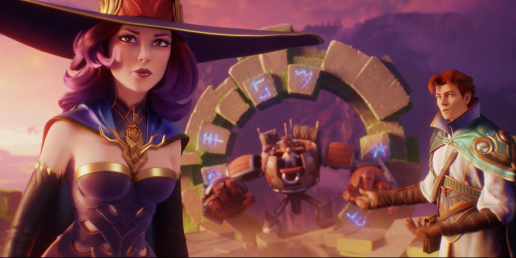
Figure 5.7 Summoners War: Friends and Rivals, Skybound North Entertainment (Com2uS
February 2019).
A World of Different Tastes
From the onset, we knew that Summoners War would be an artistically and creatively challenging project given its scope (1,000+ characters) and reach (at the time, 75 million downloads globally in 16 different languages). The SB North team, based in Vancouver and led by Catherine Winder, was charged with the monumental task of creating a global IP from their characters that needed to appeal to audiences with a wide and diverse demographic—male and female, young and old, Eastern and Western. Since both Catherine and I have had extensive experiences with animation production in both the West as well as in Asia, we knew that the key would be to start by assembling a group of artists from around the globe to help find our style. We ended up with an amazingly talented team from Vancouver, Los Angeles, Singapore, and even Humpty Doo, Australia.
Throughout the adaptation process, we were balancing different cultural norms and expectations since our Korean partners (C2) were actively involved at all key steps and decision-making milestones. We inevitably found that there were cultural differences of opinions as to what looked “beautiful” and “appealing.” There were also significant differences in social and cultural norms as to what was or wasn’t politically correct or appropriate. As we had a solid and aligned partnership, the results were ultimately better because we collaborated to find solutions that worked for multi-cultures without diluting the core property.
Many of our discussions revolved around costume design for our human characters. We solved these with design modifications as they came up, ultimately making the look that much more unique and timeless. As the various cultural differences emerged, they also highlighted and positively influenced the narrative development of our characters and the story we were telling which, in turn, influenced our style. This back and forth created an environment of open and healthy debate around design direction that helped ensure a global, timeless approach to the overall look and style.
For this initial short film, we felt it was important to first bring to life those characters already well-loved by millions of fans from the mobile game to support the transition into this new format. This included two human characters that were Summoners, a monster, and an animal- based character.
Finding the Essence of a Character: 2D Visual Development
As humans, from the moment we are born, our brains are drawn to expressive faces, interesting shapes, fluid motions, and bright colors. These are the essential ingredients of the art of animation and these things have not changed despite the visual cacophony that we now live in. To establish the Summoners War brand as a narrative IP beyond the original game, we needed to find a look that would distinguish it by visually setting it apart in an already competitive visual landscape. Creating strong, ownable, visual design of characters and environments are still the best way for the IP to cut through and make an impact. Using these philosophies as a foundation of an approach, we dove into the visual development process to create a look and style that evolved this mobile game into a fully animated feature quality CG short.
As is the case with so many mobile games, the artistic development of the art assets that goes into these games are usually derived from other well-known styles and already established archetypes—many of the in-game characters looked similar to other fantasy themed characters from other mobile games. This may make sense from a game design standpoint but is not conducive to creating unique and immediately recognizable characters for compelling stories. So, the challenge in terms of visual development was how to balance the need to EVOLVE the look of the characters so that they have a chance to standout in the noisy competitive world beyond the small screen of the mobile game, while staying true to the characters as they are known to the millions of fans.
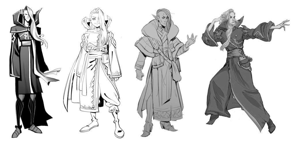
Figure 5.8 Summoners War: Elheil explorations, Skybound North Entertainment (Com2uS
2018).
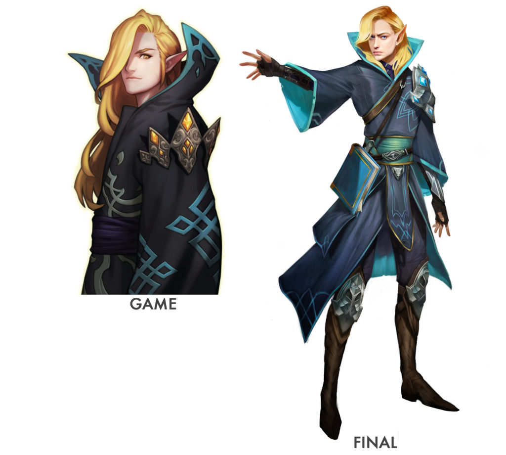
Figure 5.9 Summoners War: Elheil, Skybound North Entertainment (Com2uS 2018).
Starting with the Broadstrokes: Shapes and Colors
We started the character design process by exploring a wide range of styles with an equally wide range of concept artists from around the globe. The intention was to “open it up” and the design brief given to each unique artist was the same: to bring their own unique approach to the character design assigned to them without losing the “soul” of the character. What we got back from the artists was exciting and inspiring, and it gave us exactly what we needed to open up the conversation with our partners C2.
We started with Elheil. This character is one of the main characters in the story—a powerful Summoner who belongs to the race of Elves. Personality-wise, he is focused and aloof, and he hides a mysterious past that will reveal itself over time. To reflect his personality, we directed the concept artist to depict him as ethereally handsome, almost feminine. We wanted his body to be thin and lanky but to balance with a very strong and powerful presence in his posture and expression. The addition of little embroidered gold detailing as well as the bright blue interior surface of his robes was meant to represent a hidden inner past concealed by his sombre outer surface.
Reviewing Figure 5.8 from left to right: first is an angular silhouette that stays pretty true to the in-game costume; an “anime” style that showed him younger with a costume that incorporates more “Eastern” Influences; a “high fashion, contemporary, edgy” version that reimagines the costume as influenced by the traditional Korean “hanbok” ceremonial robe; and lastly, a version that stays fairly true to the in-game Elheil but with more elaborate and original detailing.
This initial “wide” approach helped us and C2 identify what was important and what was not to them, as well as where we might be able to push the envelope in terms of costume and style. This wide range of styles was also used as our springboard to his final design in Figure 5.9:
We also took a similar approach to finding the look for our other characters. Here are some examples for the monster Bernard below (Figures 5.10 and 5.11):
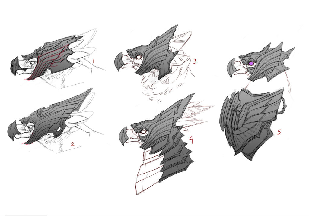
Figure 5.10 Summoners War: Bernard explorations, Skybound North Entertainment (Com2uS 2018).
As you can see, the core essence of each final character has many similarities to the original game character (Figure 5.12).
Once we honed-in on the overall style and shape, we started color and material explorations. Staying true to each character’s unique color palette from their original game design is almost
non-negotiable when it comes to respecting an existing IP like Summoners War. Color palettes, as a general rule, should be chosen in such a way that each character is made up of one to two main color combinations (with a third color or material as accent), and that color combination is unique to that character in relationship to the other characters in your IP.
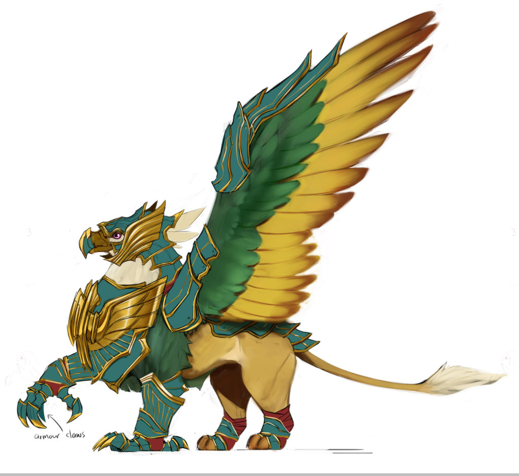
Figure 5.11 Summoners War: Bernard, Skybound North Entertainment (Com2uS 2018).
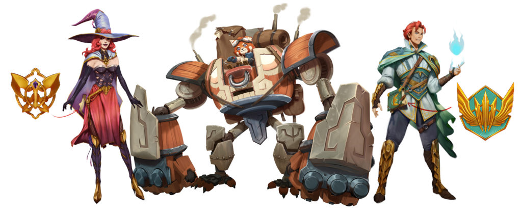
Figure 5.12 Summoners War: Morgana, Batu and Durand, Skybound North Entertainment
(Com2uS 2018).
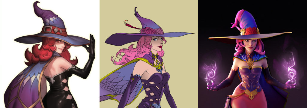
Figure 5.13 Summoners War: Morgana adaptation, Skybound North Entertainment (Com2uS 2018).
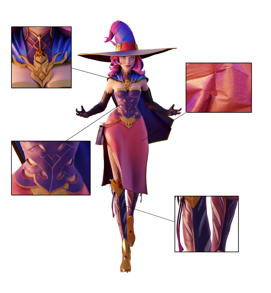
Figure 5.14 Summoners War: Morgana details, Skybound North Entertainment (Com2uS
2018).
Marvel characters, for example, do an amazing job of playing up the iconic elements of their characters to ensure audiences immediately identify with the applicable character. Think about the red and gold of Ironman, the green and purple of the Hulk, the red/white/blue of Captain America: all are unique and INSTANTLY RECOGNIZABLE, no matter how small the screen, in 2D or 3D, near or far. This kind of instant recognizability is an important characteristic for which to aim, especially in an era when it is impossible to know exactly WHERE and HOW your characters will be seen. We used this same philosophy when choosing our palette for our Summoners War characters.
Morgana is one of our lead characters and a Summoner. Personality-wise, she is a strong, confident and mesmerizingly beautiful Summoner who naturally takes charge in any situation. Since she was such a recognizable character from the game, we felt strongly that we had to keep the more obvious design elements “as is” in her final design. These included elements such as her wide brim hat, and her flaming red hair and cape. However, in order to add a little more visual sophistication, in keeping with her personality, we decided to evolve her outfit and hair color to better reflect the depth and complexity of her character (Figure 5.13).
We explored two-tone materials with complex lighting behaviors—materials such as Thai silk that has a base color as well as a secondary color when lit from an oblique angle to the viewer. We chose to change the color of her bodice from black to a shiny purple leather to reinforce what became her signature color scheme: purples and pinks, with gold metallic accents. Peter Chung (Aeon Flux Creator/Director) who led her design, also pushed us to find a unique language for ornamentation that we felt was a good evolution of how she looks in game. Instead of the diamond shaped peek-a-boo openings on the sides of her bodice, Peter reimagined it as voids that resulted from an almost Celtic-like weaving of wide leather strips.
This unique ornamentation pattern was echoed in the other parts of her outfit that helped to lift her up away from generic fantasy clichés and into a more timeless sophisticated realm.
Modeling, Textures, Shaders, & Lighting: Making a Character Look Awesome
In 2D animation and character design, the steps from conception to perception by audience are much more direct. What this means is that usually what your art team draws is directly translated to what your audience sees on the screen. In 3D animation, however, the line between character-concept to the audience is much more complex, involving many specialists and technical steps along the way, all of which influence the final look of a character. These steps include:
1. Concept art
2. 3D sculpting
3. Animation rigging
4. 3D animation
5. Shader development
6. Lighting
7. Rendering
8. Compositing and output
It is important to keep in mind that 3D sculpting and shader development for lighting are crucial steps where technological process can easily over-ride the artistic goals of the character, so we will focus on this process for Summoners War and how we managed to strike the right balance.
More information follows in the textbook:
WATCH IT NOW
Summoners War:
“Friends & Rivals”

